This is a practice exercise for using container controls in WinForms stated in MCTS 70-511 book.
Hope this helps.!!
https://drive.google.com/drive/u/0/folders/0B50nOWpE-RyLfjhLa2oyc1l3TUZsV3dXOS01THZMUm1PVG53LTFMdU94bGdORnh2RG5TY28
Saturday, April 25, 2015

Monday, April 20, 2015
Panel control in Windows Forms
Some important properties of panel control have been highlighted here.
1. Border Style


2. Border Style


Since I have set the AutoScroll property to True I can scroll to see the invisible controls out side the panel border.
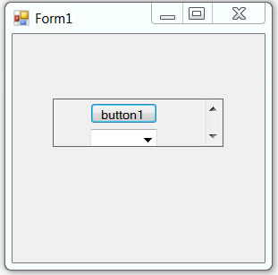
1. Border Style
2. Border Style
Since I have set the AutoScroll property to True I can scroll to see the invisible controls out side the panel border.
Friday, December 26, 2014
Flipping an UI element
What happens when you flip an UI element?
The following button has been flipped horizontally.
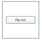

The button was flipped, but it was also moved. That's because the button was flipped from its top left corner. To flip the button in place, you want to apply the ScaleTransform to its center, not its corner. An easy way to apply the ScaleTransform to the buttons center is to set the button's RenderTransformOrigin property to 0.5, 0.5.

To flip the button vertically, set the ScaleTransform object's ScaleY property.
<Button RenderTransformOrigin=".5, .5" Height="50" Width="100" VerticalAlignment="Bottom">
<Button.RenderTransform>
<ScaleTransform ScaleY="-1"></ScaleTransform>
</Button.RenderTransform> Flipped Button
</Button>

The following button has been flipped horizontally.
<Button Height="50" Width="100" VerticalAlignment="Bottom">
<Button.RenderTransform>
<ScaleTransform ScaleX="-1"></ScaleTransform>
</Button.RenderTransform> Flipped Button
</Button>
<Button RenderTransformOrigin=".5, .5" Height="50" Width="100" VerticalAlignment="Bottom">
<Button.RenderTransform>
<ScaleTransform ScaleX="-1"></ScaleTransform>
</Button.RenderTransform> Flipped Button
</Button>
To flip the button vertically, set the ScaleTransform object's ScaleY property.
<Button RenderTransformOrigin=".5, .5" Height="50" Width="100" VerticalAlignment="Bottom">
<Button.RenderTransform>
<ScaleTransform ScaleY="-1"></ScaleTransform>
</Button.RenderTransform> Flipped Button
</Button>
Monday, December 15, 2014
Modified form submission app in ExtJs 5.0, MVC Web Api, Entity Framework 6 in ASP.NET
I have modified (one of my previous post) using
Entity framework 6, MVC Web Api, Ext Js 5.0, VS 2013. (With
create, read functions in database).
I can share the tutorial with you if requested.
Saturday, December 6, 2014
Behavior of TileMode property with its values in ImageBrush object
1) TileMode ="FlipX"
<Grid.Background>
<ImageBrush TileMode="FlipX" Viewport="0,0,.5,.5"
ImageSource="C:\Users\Public\Pictures\Sample Pictures\Tulips.jpg">
</ImageBrush>
</Grid.Background>

2) TileMode ="FlipY"
<Grid.Background>
<ImageBrush TileMode="FlipY" Viewport="0,0,.5,.5"
ImageSource="C:\Users\Public\Pictures\Sample Pictures\Tulips.jpg">
</ImageBrush>
</Grid.Background>

<Grid.Background>
<ImageBrush TileMode="FlipXY" Viewport="0,0,.5,.5"
ImageSource="C:\Users\Public\Pictures\Sample Pictures\Tulips.jpg">
</ImageBrush>
</Grid.Background>

<Grid.Background>
<ImageBrush TileMode="FlipX" Viewport="0,0,.5,.5"
ImageSource="C:\Users\Public\Pictures\Sample Pictures\Tulips.jpg">
</ImageBrush>
</Grid.Background>
2) TileMode ="FlipY"
<Grid.Background>
<ImageBrush TileMode="FlipY" Viewport="0,0,.5,.5"
ImageSource="C:\Users\Public\Pictures\Sample Pictures\Tulips.jpg">
</ImageBrush>
</Grid.Background>
3) TileMode ="FlipXY"
<ImageBrush TileMode="FlipXY" Viewport="0,0,.5,.5"
ImageSource="C:\Users\Public\Pictures\Sample Pictures\Tulips.jpg">
</ImageBrush>
</Grid.Background>
ImageBrush object
The ImageBrush object is used to paint objects by using an image as the source for the brush.
Example:
<Window x:Class="Brushes.MainWindow"
xmlns="http://schemas.microsoft.com/winfx/2006/xaml/presentation"
xmlns:x="http://schemas.microsoft.com/winfx/2006/xaml"
Title="MainWindow" Height="350" Width="525">
<Grid>
<Grid.Background>
<ImageBrush
ImageSource="C:\Users\Public\Pictures\Sample Pictures\Desert.jpg">
</ImageBrush>
</Grid.Background>
</Grid>
</Window>


Example:
<Window x:Class="Brushes.MainWindow"
xmlns="http://schemas.microsoft.com/winfx/2006/xaml/presentation"
xmlns:x="http://schemas.microsoft.com/winfx/2006/xaml"
Title="MainWindow" Height="350" Width="525">
<Grid>
<Grid.Background>
<ImageBrush
ImageSource="C:\Users\Public\Pictures\Sample Pictures\Desert.jpg">
</ImageBrush>
</Grid.Background>
</Grid>
</Window>
We can select a portion of the source image to be used for painting by setting the ViewBox property.The following example shows cropping the upper left quarter of an image and using it for the ImageBrush object.
<Window x:Class="Brushes.MainWindow"
xmlns="http://schemas.microsoft.com/winfx/2006/xaml/presentation"
xmlns:x="http://schemas.microsoft.com/winfx/2006/xaml"
Title="MainWindow" Height="350" Width="525">
<Grid>
<Grid.Background>
<ImageBrush Viewbox="0,0,.5,.5"
ImageSource="C:\Users\Public\Pictures\Sample Pictures\Desert.jpg">
</ImageBrush>
</Grid.Background>
</Grid>
</Window>
Sunday, October 19, 2014
Using animation with triggers
We should remember that in WPF refers to an automated property change over a set period of time. You can animate an element’s size, location, color, or virtually any other property associated with an element.
You can use the Animation classes to implement these changes. So we use "Animation" objects for this purpose.The "Storyboard" object contains Animation objects and determines which element and property the Animation objects affect. As the answer to the question of "How do you start and stop an animation", is discussed here with an example.
We use "Trigger" object for this. All "Animation" objects must be housed within a "Trigger" object.
Following example:
1. BeginStoryboard is an action; it indicates that the contained storyboard should be started.
2. The EventTrigger class defines a collection of actions that should be initiated when the trigger is activated, and in this example, BeginStoryboard is the action that is initiated.
3. Thus, when the button indicated in this trigger is clicked, the described animation runs.
See the animation:
http://screencast.com/t/cuuXiQdRU
You can use the Animation classes to implement these changes. So we use "Animation" objects for this purpose.The "Storyboard" object contains Animation objects and determines which element and property the Animation objects affect. As the answer to the question of "How do you start and stop an animation", is discussed here with an example.
We use "Trigger" object for this. All "Animation" objects must be housed within a "Trigger" object.
Following example:
1. BeginStoryboard is an action; it indicates that the contained storyboard should be started.
2. The EventTrigger class defines a collection of actions that should be initiated when the trigger is activated, and in this example, BeginStoryboard is the action that is initiated.
3. Thus, when the button indicated in this trigger is clicked, the described animation runs.
See the animation:
http://screencast.com/t/cuuXiQdRU
<Window x:Class="App1.MainWindow"
        xmlns="http://schemas.microsoft.com/winfx/2006/xaml/presentation"
        xmlns:x="http://schemas.microsoft.com/winfx/2006/xaml"
        Title="MainWindow" Height="350" Width="525">

    <Grid>
        <Button Height="30" Width="200" HorizontalAlignment="Left">
            Animated Button
            <Button.Triggers>
                <EventTrigger RoutedEvent="Button.Click">
                    <EventTrigger.Actions>
                        <BeginStoryboard>
                            <Storyboard>
                                <DoubleAnimation Duration="0:0:5" Storyboard.TargetProperty="Height" To="200" />
                            </Storyboard>
                        </BeginStoryboard>
                    </EventTrigger.Actions>
                </EventTrigger>
            </Button.Triggers>
        </Button>
    </Grid>
</Window>
Subscribe to:
Posts (Atom)